SPC - Smart Performance Charts for the 21st Century
Still using line and bar charts from the last century?
Line and bar charts with trendlines can be misleading and are often fake news.
I just made my first SPC charts and the QI Macros were very easy and user friendly. This is going to be a great tool.
– Jim Welsh - Lennox Industries
Smart Performance Chart #1: The Control Chart
Every business needs to monitor and sustain improved performance. Unfortunately, most companies rely on spreadsheets or line charts. This leads to knee-jerk responses to increases or decreases in revenue. It leads to a lot of wasted effort trying to figure out why a number went up or down.
I’ll let you in on a little-known secret: most of this up and down variation is normal. There’s nothing to do. You need a chart that can alert you to uncommon variation—statistically significant upward or downward movement. These charts have been around for 100 years. It’s a specialized form of a line chart called a control chart. It can be used to monitor performance of your key process indicators (KPIs) and anything else of importance.
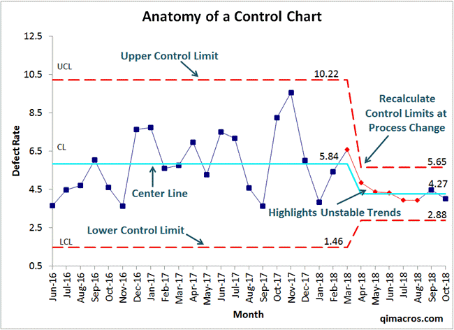
Control charts use your data about money, time, defects or whatever to calculate upper and lower “control” limits (UCL/LCL). 99.7% (997/1000) of all points should lie between these two lines. Otherwise, there’s a potential instability in performance. QI Macros will analyze and identify these “unstable” conditions automatically.
The example was drawn from actual data about patient falls in a hospital. The blue points show that the process was stable and predictable before improvement. You could count on an average of 5.84 falls per 1000 patient days. The high points are not cause for alarm, nor are the low points a cause for celebration.
You can see that the improvement team reduced falls from 5.84 to 4.27. The red points show a trend (uncommon variation) associated with the improvement. Then we can recalculate the UCL/LCL to show the improved performance and variability.
Excel Trend Lines Are Often Fake News
Control charts help prevent wild goose chases too often caused by line charts. If, for example, we drew the initial data as a line chart with a trendline, we might be startled and concerned. In this case, however, the trendline is misleading.
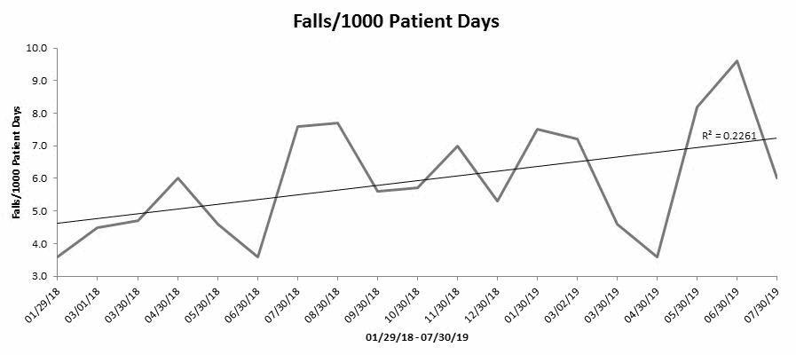
Most people fail to add the R2 (goodness of fit) metric to their trend line. An R2 of 0.2261 is only a 22.6% fit. A good fit is 0.8 or 80%, so I wouldn’t trust this trendline to tell me anything. Patient falls aren’t really going up.
Similarly, a trendline might show that sales are going up when they are not. Trendlines are more often misleading than informative. Trend lines are fake news. Control charts, on the other hand, bring real science to understanding business performance.
Smart Performance Chart #2: The Pareto Chart
You’ve heard of Pareto’s 80/20 Rule haven’t you? It states that 20% of your customers create 80% of your revenue (or headaches). It also means that 20% of your business causes 80% of the lost profits and productivity. It might surprise you to learn that most businesses waste a third of total expenses fixing or trashing things that shouldn’t have been broken in the first place.
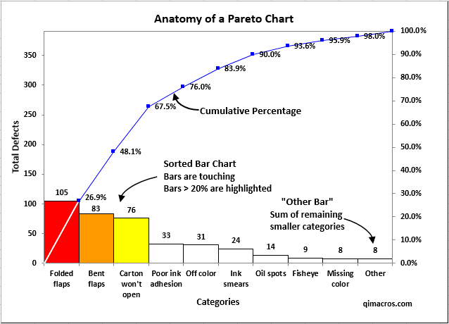
What most people don’t know is that Pareto’s Rule is a “power law”; it applies within the 20%. I call this the 4-50 Rule: 4% of your business produces over 50% of the waste, rework and lost profit. That’s 4 steps out of 100 or one step out of 25. So, you don’t have to fix everything, you just need to pinpoint the one step (I call this the Million-Dollar Misstep) to eliminate 50% of these preventable expenses. The chart to find these missteps is called a Pareto chart.
While most line and bar charts are the “dumb and dumber” of Excel charts, if you combine them in a smart way, they yield critical insights for improvement. A Pareto chart combines a sorted bar chart with a cumulative line graph to focus attention. The “big bar” on the left helps pinpoint the biggest problem area (Folded Flaps). Fix that one problem and you will eliminate 26.9% of the defects, mistakes and errors devouring your profits and productivity. It's just that easy.
Then fix each of the other two “big bars” to save 67.5% of all errors. As you know, fixing a single defect can cost as much as producing 100 unblemished items. This applies to everything from pistons to patients, purchase orders to invoices. Every defect, mistake or error eats profit.
Smart Performance Chart #3: The Histogram
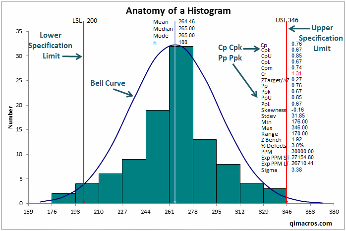
You’re probably familiar with the “bell-shaped” curve of a histogram. It’s widely used in manufacturing to analyze conformance to customer specifications. A product shouldn’t be too tall, too short, too dense, too porous, too fat, too thin, etc. While histograms can show the spread of a measurement as shown below, it can also analyze speed of service.
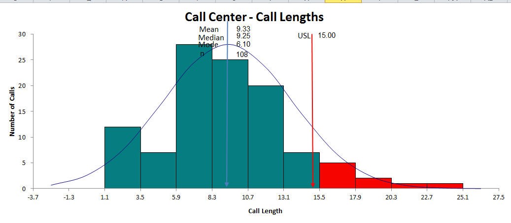
Histograms are especially useful for analyzing wait times and turnaround times (TAT). Think about it, how long do you want to wait for a cup of coffee, an order at a fast-food restaurant or to be seen by your doctor? Zero minutes and zero seconds would be ideal wouldn’t it? This leads to a one-sided histogram. This example shows call length in a call center. In this example, I’ve highlighted the calls exceeding the desired 15 minutes.
Here's a healthcare example of time to thrombolytics (wait time for a clot busting drug for stroke victims). After 60 minutes, patients start to suffer long-term impairment.
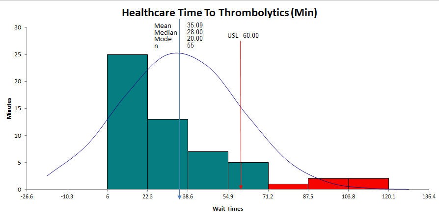
As you can see, both of these charts highlight the need for improvement. Histograms are the key tool for monitoring and improving wait and turnaround times.
The Three Key Charts to Optimize Your Business Performance
Control charts, Pareto charts and histograms give you the power to understand and improve performance in ways you probably haven’t even imagined. And QI Macros make it easy to create these charts. Learn more about these charts and download a 30-day free trial.
Join 100,000+ Users
in 80 Countries


KnowWare International, Inc.
2696 S. Colorado Blvd., Ste. 555
Denver, CO 80222 USA
Toll-Free: 1-888-468-1537
Local: (303) 756-9144