Home »
Blog » Excel » Page 9
Improvement Insights Blog
Posts tagged "Excel"
Nobody wants to read your spreadsheet! No matter how hard you try to make it pretty, create great labels or whatever, the only person who can read your spreadsheet is a CFO or Excel spreadsheet geek. And the Excel geek is going to tell you 10 ways to make it prettier.
The purpose of data is to provide insights for action, not just report past performance.
How Do I Know That Most Excel Users Try to Make Their Spreadsheets Readable By People?
According to Renu Davi, Sr. Program Manager for Excel, Microsoft tracks how people use Excel. The vast majority of the 650 million users use it for lists and reports.
Continue Reading "Nobody Wants to Read Your Spreadsheet!"
Posted by Jay Arthur in Data Mining, QI Macros, Six Sigma.
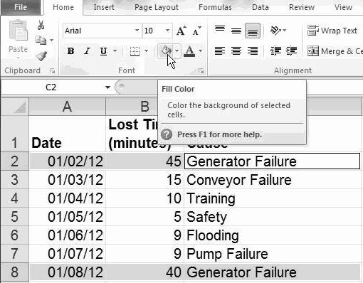
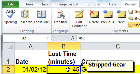
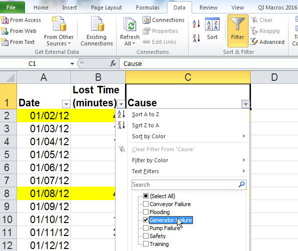
You can use Excel’s data formatting, commenting and filtering tools to help visualize and clarify your data.
Highlighting: Select cells and click on Home-Fill Color to highlight cells:
Commenting: To add comments to any cell, click on Data-Insert Comment:
Subset: To select a subset of your data, click on Data-Filter and select the desired content:
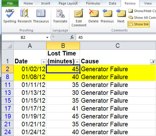
Excel will simplify and streamline your data for ease of analysis:
Excel has many powerful data exploration and visualization tools. Play with them!
Continue Reading "Data Visualization and Exploration In Excel"
Posted by Jay Arthur in Excel, Six Sigma.
Microsoft added a box and whisker plot to Excel 2016, but it’s not everything you might hope for. Here’s an Excel 2016 box and whisker plot:
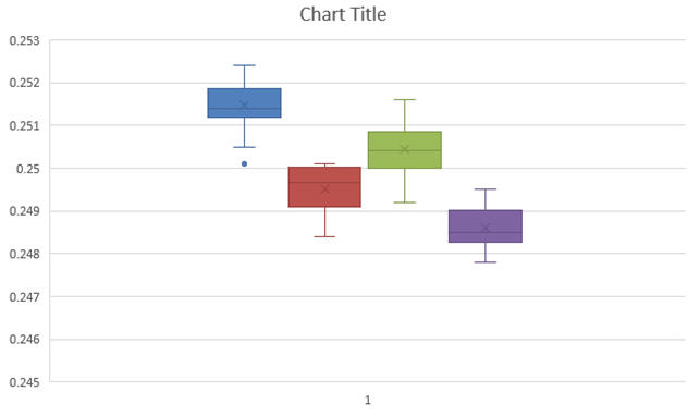
You might notice that the whiskers have a crossbar on the end. It seems to have a spare “x” in the middle of each box and it’s a little hard to see where the median is. And there are unnecessary gridlines that are considered chartjunk. It does, however, show the outlier below the first box.
Here’s what the QI Macros Box and Whisker Plot looks like:
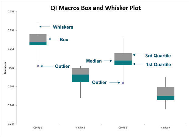
The whiskers are whiskers. The median is easily visible.
Continue Reading "What’s Wrong with the New Excel 2016’s Box and Whisker Plot?"
Posted by Jay Arthur in Excel, QI Macros, Six Sigma, Statistics.
I first learned how to draw Pareto charts by hand using engineering paper if you can believe it. Our trainers were very specific about how they were to be drawn. One of the earliest references I can find is Kaoru Ishikawa’s Guide to Quality Control. Here’s the correct way to draw a Pareto chart using data from Ishikawa’s book:
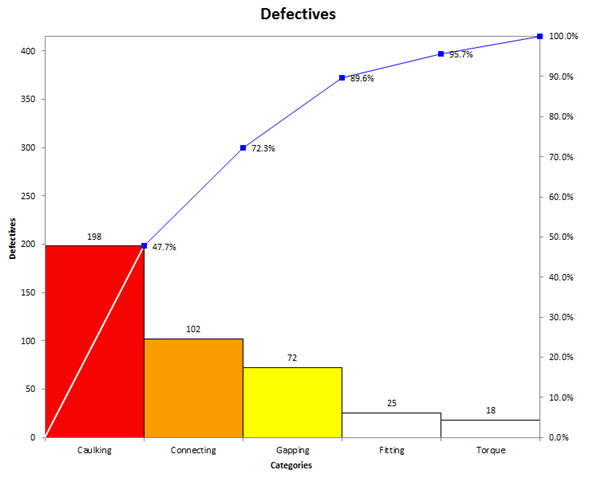
The bars should be touching and the cumulative percentage line should go from corner to corner of the first bar.
Unfortunately, most Pareto charts drawn by computer look like the following one, bars not touching and cumulative line running out of the center of the top of the first bar.
Continue Reading "The Correct Way to Draw a Pareto Chart"
Posted by Jay Arthur in QI Macros, Six Sigma.
Downloaded and installed Excel for the iPad. It’s provides basic Excel functionality. As expected, it will handle QI Macros charting templates, but won’t run macros. https://www.qimacros.com/store/?cat=14
To get the full functionality of the QI Macros or to run any Visual Basic addins, you’ll need a Windows 8 tablet running Excel 2010 or Excel 2013.
I tried several Win 8 tablets.
The Surface Pro is fast, but heavy and runs warm because of the I5 processor. I didn’t love the keyboard.
I tried the Samsung, but it had an idiot light that blinked when closed that ate 5% of the battery every day.
Continue Reading "Excel App for the iPad and QI Macros"
Posted by Jay Arthur in QI Macros.
In a recent blog post, Minitab asked: “Have you ever found yourself switching back and forth between a Microsoft Excel file and Minitab Statistical Software just to complete a single analysis?”
Comparing Minitab to Excel (without QI Macros) is a bit like comparing a calculator to an abacus.
If you have the QI Macros add-in for Excel, you don’t have to switch. You can do everything in Excel.
Creating Graphs with Raw Data Easily
The blogger says: “Just try creating a Pareto Chart in Excel…I dare you!”
I’ll take that dare. If you have a column of defects (below), just click on the title for the column and choose the QI Macros Pareto Chart.
Continue Reading "Minitab and Excel: Which Should I Use and When?"
Posted by Jay Arthur in QI Macros.
Use a histogram to determine the distribution of measurable data and the capability (i.e., the level of performance the customers can consistently expect) of the process. Process capability is determined using your data and the customer’s upper specification (USL) and lower specification limits (LSL).
Its easy to create a histogram in Excel using the QI Macros. See
http://www.youtube.com/user/QIMacros#p/a/u/2/tqlFKtmAxbU
Continue Reading "Create a Histogram in Excel Using the QI Macros"
Posted by Jay Arthur in QI Macros.

