Run Charts vs Control Charts
Run charts used to be a bridge to control charts. You no longer need to build a bridge. Just start with Control Charts.
Run charts used to be a bridge to control charts. You no longer need to build a bridge. Just start with Control Charts.
20th Century quality was about manufacturing. (Old school)
21st Century quality is about services. (New school)
What we need now is a fresh approach to Lean Six Sigma for the 21st Century. I call it Agile Process Innovation.
Download my free Agile Process Innovation ebook from https://www.qimacros.com/pdf/Agile-Lean-Six-Sigma.pdf.
We’re excited! From adding Menu Icons to make things easier to find (and easier to add to your Excel Quick Access Toolbar), to adding a Search function to answer those “Where is that one chart…” questions, to the Control Chart Template Wizard… we think this is the most powerful, easiest to use version of QI Macros that there is.
This version is compatible with:
If you’d like to upgrade to QI Macros 2018.10, you can purchase a new license by clicking HERE.
Statisticians say “correlation does not equal causation,” but what if we can prove cause and effect using new tools? The Book of Why, by Judea Pearl explains how this new science of cause and effect has shifted statistics over the last 30 years.
Almost 100 people signed up for this webinar, with Jay Arthur demonstrating some of the more useful features of QI Macros.
Some of the attendees were familiar with the software and already use it, some had not yet begun to use it; all were interested in learning new ways that QI Macros can help them with their Agile Lean Six Sigma and Quality Improvement efforts. (You can hear him answering questions typed in by webinar attendees.)
If you saw a feature demonstrated in the webinar that might have been added to QI Macros after the version you’re using (for instance, the automated Value Stream Map), you may need to purchase an upgrade to bring your QI Macros to the current version.
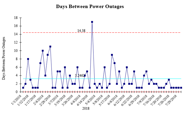
Jeremy Singer-Vine publishes a Data Is Plural newsletter about available data sets. I took the U.S. & Canada power outage data from 2018 and used it with QI Macros Data Mining Wizard to create an improvement project.
I used a g Chart of time between power outages. Averaging a little over 3 days between outages.
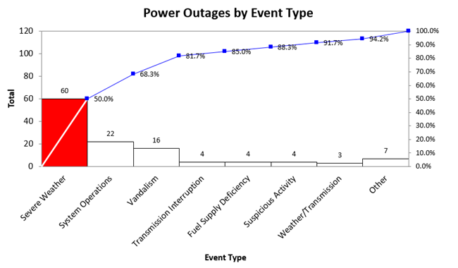
Then, the Data Mining Wizard found the most common cause of outages to be weather. But look at number two: operations. That’s something that could be fixed. Vandalism could also be prevented.
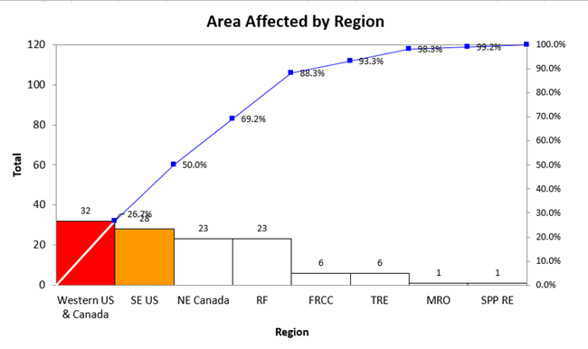
Next, where are outages most likely to occur:
And what month? Readiness months: March-July.
A district level manager was hopping mad about something. I decided to see if I could use pacing and leading to calm her down and get back to solving the problem to meet her needs.
Continue Reading "Building Rapport with Improvement Teams – Step 3"
My boss sent me to talk to a cranky manager about a software project he wanted to do. Here’s how I used non-verbal rapport to connect with him in 30-60 seconds.
Continue Reading "Building Rapport with Improvement Teams – Step 2"
The September, 2018 Money magazine article about Bethenny Frankel opens with a rant about Postmates. Frankel ordered a muffin, bagel with cream cheese and a coffee for delivery. The muffin and bagel made it, but without cream cheese or coffee.
Welcome to Hassle America where even simple things seem to be impossible.
We order lunch once a week at the office, but hardly a week goes by without some problem. Last week, Grubhub cancelled our order without telling us. Some weeks the chicken salad comes without chicken. Some weeks we’re missing a dish that was ordered.
Welcome to Hassle America.
I was tasked with training the leadership team of U S West, the president and his vice presidents. Here’s how I started to build rapport with the leadership team and every team afterwards.
Continue Reading "Building Rapport with Improvement Teams – Step 1"

KnowWare International, Inc.
2696 S. Colorado Blvd., Ste. 555
Denver, CO 80222 USA
Toll-Free: 1-888-468-1537
Local: (303) 756-9144
