Home »
Blog » Statistics » Page 2
Improvement Insights Blog
Latest "Statistics" Posts
SPC software companies keep trying to gain some edge by tweaking the formulas for various statistics, but is the quest for the next decimal place of precision useful? If you’re trying to send a rocket to Mars? Absolutely. If you’re trying to tune up a business process, not really. Here’s why.
“Hi, I’m Jay Arthur, author of “Lean Six Sigma Demystified” and QI Macros [software]. I’m going to talk to you about what I call The Next Decimal Place.
“Because I’ve been in the software business, [I’ve seen] people and try and change formulas. Let’s say it’s Cp and Cpk.
Continue Reading "The Next Decimal Place"
Posted by Jay Arthur in Improvement Insights, Statistics.
How you design software can slash the learning curve. Did you design it for college students studying statistics or a business man or woman who just wants to achieve a result with minimal time, effort and training?
“Hi, Jay Arthur with the QI Macros [software]. I wanted to talk to you today about Six Sigma SPC software.
“Now, there’s some big dogs out there, and if you look at them real closely, you’ll see they were designed by professors in the statistical department who wanted to create software to train students in statistics. It has every nook and cranny and option and tweak and everything that you can possibly do to teach people statistics, and fill up curriculums that’ll last an entire semester to focus on different things that you could do to tweak all these little statistics.
Continue Reading "How Six Sigma SPC Software Design Can Slash the Learning Curve"
Posted by Jay Arthur in Improvement Insights, QI Macros, Statistics.
Everyone thinks I’m a statistician by trade, but nothing could be further from the truth. Here’s my journey.
“Hi, this is Jay Arthur, author of “Lean Six Sigma Demystified” and the QI Macros [software]. I’m here in Maui Kaanapali Villas in Maui.
“One of the things that I want you to think about is because I wrote the QI Macros, everybody thinks I’m a statistician or something, but… the truth is a little bit further from that.
“Suzuki the Zen master had a story of four horses: One ran easily, one you had to flog it a little bit, one he had to flog a little more, and the fourth one you had to flog a lot to get it to move.
Continue Reading "Jay is the Fourth Horse of Statistics"
Posted by Jay Arthur in Improvement Insights, QI Macros, Statistics.
At the 2018 Magnet Nursing conference in Denver, I saw many improvement posters using line or bar charts with an added trend line to show improvement. Unfortunately, few of the trends were valid. Here’s why:
Continue Reading "Trendlines Are Rarely Improvements"
Posted by Jay Arthur in Improvement Insights, QI Macros, Statistics.
Too many quality professionals are clinging to the way things have always been done. There’s some sort of taboo about doing things quickly and easily. What are the differences between 20th and 21st Century Quality? Watch and find out:
Continue Reading "20th vs 21st Century Quality"
Posted by Jay Arthur in Data Mining, Improvement Insights, QI Macros, Six Sigma, Statistics.
Statisticians say “correlation does not equal causation,” but what if we can prove cause and effect using new tools? The Book of Why, by Judea Pearl explains how this new science of cause and effect has shifted statistics over the last 30 years.
Continue Reading "The Book of Why?"
Posted by Jay Arthur in Improvement Insights, Statistics.
I’ve noticed a disturbing trend. Customers call us wanting to know all of the background about the hows, whys and formulas of a chart. I think they are afraid someone will challenge or ridicule their analysis. Here’s what I think.
Continue Reading "Fear of Ridicule and What to Do About It"
Posted by Jay Arthur in Improvement Insights, QI Macros, Six Sigma, Statistics.
People have been trying to make statistics simple and easy to understand for decades.
But statistics aren’t simple. Maybe we should change how we teach them?
Continue Reading "Statistics are Simple"
Posted by Jay Arthur in Improvement Insights, QI Macros, Statistics.
I have found that an XmR chart is the easiest way to display attribute data. Simply convert the numerator/denominator into a ratio and plot the ratio.
- defects per day could be a c chart, but an XmR chart works just as well
- defects/samplesize could be np, p or u chart, but XmR chart works just as well using the ratio
Almost two decades ago, Tom Pyzdek said: X chart provides an excellent approximation to the p chart.
More recently, Donald Wheeler noted that XmR chart limits will be very close to c, np, p or u chart limits if the underlying distribution is correct.
Continue Reading "Use XmR Charts instead of c, np, p and u Charts"
Posted by Jay Arthur in QI Macros, Six Sigma, Statistics.
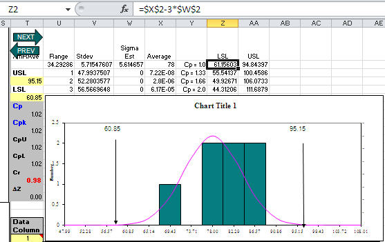
Customer asked me what seemed like a strange question: What specification limits do I need to get a Cp greater than one? Usually her customer should set specification limits, but her boss wanted to know what they could deliver. Hmmmm!
Then I realized that since QI Macros templates (e.g., XmR chart) calculate the average and sigma estimator, the LSL/USL for Cp = 1.0 would be:
LSL = Average – 3*SigEst USL = Average+ 3*SigEst
For Cp = 1.33, just change the 3 to a 4; Cp = 1.66, change the 3 to a 5. Here’s an XmR chart template with some sample data and calculations to reverse engineer spec limits:
Continue Reading "What USL/LSL Do I Need for Cp>1?"
Posted by Jay Arthur in QI Macros, Six Sigma, Statistics.

