Home »
Blog » QI Macros » Page 23
Improvement Insights Blog
Latest "QI Macros" Posts
I first learned how to draw Pareto charts by hand using engineering paper if you can believe it. Our trainers were very specific about how they were to be drawn. One of the earliest references I can find is Kaoru Ishikawa’s Guide to Quality Control. Here’s the correct way to draw a Pareto chart using data from Ishikawa’s book:
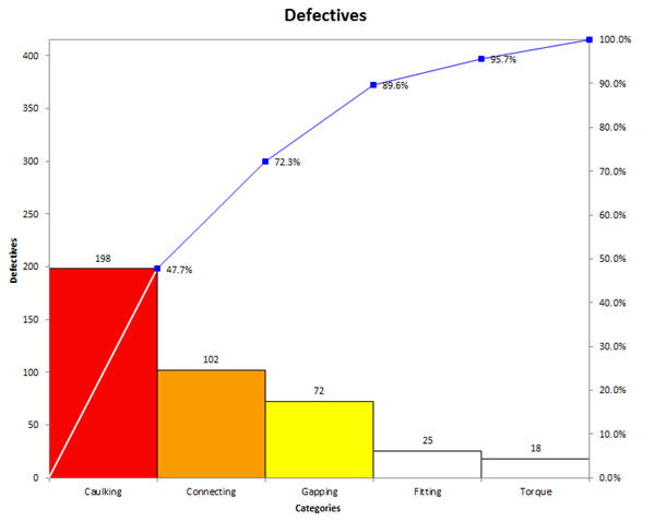
The bars should be touching and the cumulative percentage line should go from corner to corner of the first bar.
Unfortunately, most Pareto charts drawn by computer look like the following one, bars not touching and cumulative line running out of the center of the top of the first bar.
Continue Reading "The Correct Way to Draw a Pareto Chart"
Posted by Jay Arthur in QI Macros, Six Sigma.
Customers invariably want three things from any supplier; they want you to be better, faster and cheaper that your competition and your past performance. It’s vital to find out what they want. Sometimes it’s as easy as asking: “What can we do better?” and then listening carefully to the response.
One way to figure out what customers want is to develop a voice of the customer (VOC) diagram and keep it updated.
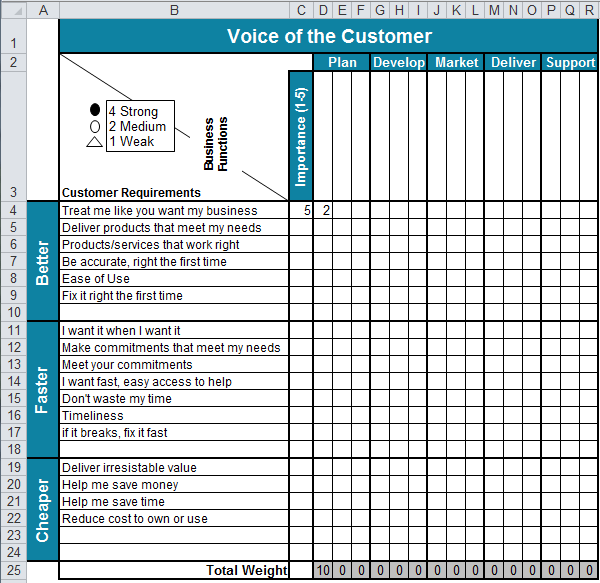
Along the left-hand side are the customer’s requirements for better, faster and cheaper. The goal is to capture exactly what they say in their language. Then translate what they say into business changes that deliver on those requirements.
Continue Reading "What Do Customers Want?"
Posted by Jay Arthur in QI Macros, Six Sigma.
I have found that a high number of people have a fear of math. They seem to think that you are either born with math skills or you aren’t.
In the Jan/Feb 2016 Scientific American Mind, author Carol Dweck reviews the most recent research into The Remarkable Reach of Growth Mind-Sets.
One study by Kathy Liu Sun found that middle school math teachers that embraced growth mind-set but did not back it up with growth mind-set teaching methods such as emphasizing underlying concepts, giving feedback and giving students a chance to revise and resubmit their work caused their students to develop a fixed mind-set.
Continue Reading "Is a Fear of Math Stopping Your Six Sigma Projects?"
Posted by Jay Arthur in QI Macros, Six Sigma.
In his speech Sunday at IHI, Don Berwick called for everyone to “recommit to improvement science” (step 5 in ERA 3 of healthcare transformation).
He sounded annoyed with the lack of use of Lean Six Sigma tools and methodologies.
I understand his frustration. I was there in 2006 when he asked everyone to “pledge allegiance to science and evidence.”
Over the years, I’ve done a stroke tally of the quality tools used in IHI poster presentations.
I gave each poster one checkmark for each type of tool used.
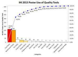
Sadly, even with all of the emphasis on control charts, Pareto charts and other tools of quality, they are used rarely in poster presentations.
Continue Reading "IHI 2015 Poster Use of Quality Tools"
Posted by Jay Arthur in Healthcare, QI Macros, Six Sigma.
At the ASQ Lean Six Sigma Conference, the QI Macros booth was right next to my biggest competitor–the big dog in the market (you know who they are). A guy comes up to me and says: “We bought 150 copies of their product (pointing to the booth next to me) and it was really expensive. I asked our Green Belts if they were using it and they said No, it’s too hard to use. What are they using; they said Excel.” He went on to say: “I’m thinking about getting the QI Macros because everyone is comfortable with Excel.”
And he wasn’t the only attendee who complained about the same issues: costs too much and too hard to use.
Continue Reading "Complex Statistical Software–a Barrier to Six Sigma"
Posted by Jay Arthur in QI Macros, Six Sigma.
Downloaded and installed Excel for the iPad. It’s provides basic Excel functionality. As expected, it will handle QI Macros charting templates, but won’t run macros. https://www.qimacros.com/store/?cat=14
To get the full functionality of the QI Macros or to run any Visual Basic addins, you’ll need a Windows 8 tablet running Excel 2010 or Excel 2013.
I tried several Win 8 tablets.
The Surface Pro is fast, but heavy and runs warm because of the I5 processor. I didn’t love the keyboard.
I tried the Samsung, but it had an idiot light that blinked when closed that ate 5% of the battery every day.
Continue Reading "Excel App for the iPad and QI Macros"
Posted by Jay Arthur in QI Macros.
Vanity metrics let you feel good about your business.
Productivity metrics tell you the truth about your business. From Running Lean, by Ash Maurya via the Lean Startup, here’s some productivity metrics:
- Acquisition (how do users find you?)
- Activation (do they have a great first experience?)
- Retention (do they return?)
- Revenue (how do you make money?)
- Referral (do users tell others?).
Most people want to feel good, so they often select metrics that let them feel good. The people that excel choose metrics that tell them where and how to improve.
You can chart either one with the QI Macros, but vanity charts aren’t going to help you improve.
Continue Reading "Vanity or Productivity Metrics"
Posted by Jay Arthur in Lean, QI Macros.
In a recent blog post, Minitab asked: “Have you ever found yourself switching back and forth between a Microsoft Excel file and Minitab Statistical Software just to complete a single analysis?”
Comparing Minitab to Excel (without QI Macros) is a bit like comparing a calculator to an abacus.
If you have the QI Macros add-in for Excel, you don’t have to switch. You can do everything in Excel.
Creating Graphs with Raw Data Easily
The blogger says: “Just try creating a Pareto Chart in Excel…I dare you!”
I’ll take that dare. If you have a column of defects (below), just click on the title for the column and choose the QI Macros Pareto Chart.
Continue Reading "Minitab and Excel: Which Should I Use and When?"
Posted by Jay Arthur in QI Macros.
Seth Godin’s blog brought this data to my attention: http://www.nextbigfuture.com/2011/03/deaths-per-twh-by-energy-source.html.
There’s lots of ways to display it, but I thought it would be fun to look at as Pareto charts.
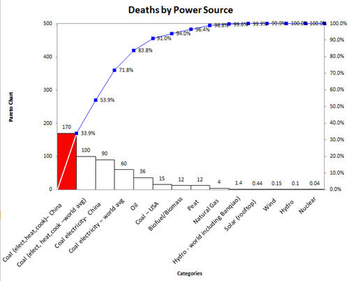
Deaths from nuclear power are small compared to the power produced. Coal and oil are still the heavy hitters in the mortality department.
Continue Reading "Deaths by Power Source Data"
Posted by Jay Arthur in QI Macros.
Use a histogram to determine the distribution of measurable data and the capability (i.e., the level of performance the customers can consistently expect) of the process. Process capability is determined using your data and the customer’s upper specification (USL) and lower specification limits (LSL).
Its easy to create a histogram in Excel using the QI Macros. See
http://www.youtube.com/user/QIMacros#p/a/u/2/tqlFKtmAxbU
Continue Reading "Create a Histogram in Excel Using the QI Macros"
Posted by Jay Arthur in QI Macros.


