Home »
Blog » QI Macros » Page 22
Improvement Insights Blog
Latest "QI Macros" Posts
Over the last 25 years, I’ve gotten to see Six Sigma failures and successes. But in spite of all of the belts trained and investments made, why isn’t product and service quality any better? Why is there so much hassle? Why aren’t more customer experiences hassle-free? I’ve developed a mental list of the most common types of failures. Here’s my fishbone diagram for Six Sigma failures. I’d encourage you to develop your own.
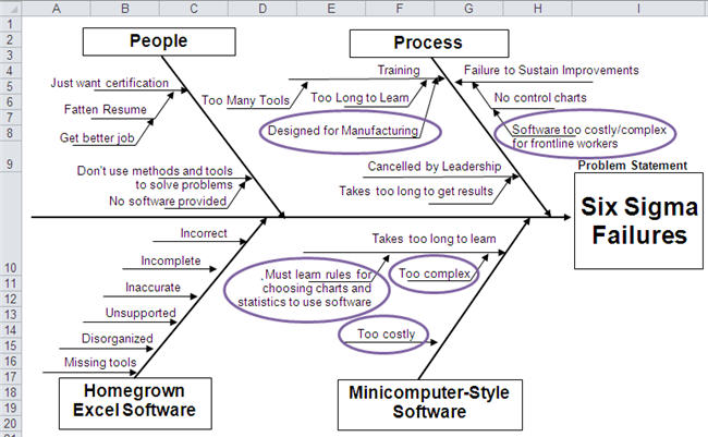
80% of the businesses in the U.S. are service businesses, yet Six Sigma training is extensively focused on the manufacturing factory floor. It takes too long to teach people everything they might need to know to solve all of the problems they might ever encounter.
Continue Reading "Why Six Sigma Fails"
Posted by Jay Arthur in Healthcare, Manufacturing, QI Macros, Service, Six Sigma.
Renu Davi, Sr. Program Manager for Excel, reported at Excelapaloosa that two-thirds of the 650 million users use Excel to make lists. The other third of users do deeper analysis, but I’m wondering how? Microsoft keeps tabs on Excel usage. Here’s some statistics for usage in an Excel workbook:
- Only 4.3% have a function like SUM(A1:B2)
- 7.5% have Pivottables
- 17% use Freeze Panes
- 54% use Merged Cells (instead of Center Across Selection which works much better in many ways)
I wonder why we need any new features if the vast majority of users don’t or won’t use them. Maybe we need to invest in teaching people how to use the Excel features they have.
Continue Reading "Users Barely Using Excel"
Posted by Jay Arthur in QI Macros, Statistics.
I got a call from a QI Macros customer who works at a luxury car dealership. Customers were upset because their cars were spending too long in the shop. The dealership tracked the length of stay of every car, the symptoms and barriers to getting the car done when expected.
I was struck by the similarities between what he was describing and a hospital. Patients come in, get diagnosed, treated, admitted and eventually discharged. This is the same problem as the maintenance shop.
I asked if the maintenance department had information about the type of problem, missing parts, age of the car and so on.
Continue Reading "How is a Hospital Like a Car Dealership?"
Posted by Jay Arthur in Healthcare, Lean, QI Macros, Service, Six Sigma.
The June, 2016 HRB article by Scott Berinato examines how to use charts and diagrams to express ideas and statistics. I agree with Anmol Garg, Tesla data scientist quoted in the article, “You can’t find anything looking at spreadsheets and querying databases. It has to be visual.”
Bernato says: “Convenient is a tempting replacement for good, but it will lead to charts that are merely adequate or, worse, ineffective.” He separates visualizations into four components: idea generation, idea illustration, visual discovery and everyday dataviz. Simple line, bar and pie charts are great for idea generation and illustration, but terrible for visual discovery and dataviz.
Continue Reading "Data Visualizations that Really Work"
Posted by Jay Arthur in QI Macros, Six Sigma, Statistics.
Creating homemade Cp and Cpk templates often results in incorrect values. There are many, many mistakes you might make without realizing. Here are a few examples.
A customer sent me their home grown template for calculating Cp and Cpk and wondered why the QI Macros got such radically different values. It was easy to see from their data that they were using standard deviation, not Sigma estimator (Rbar/d2) to calculate Cp and Cpk. Use Stdev to calculate Pp and Ppk, not Cp and Cpk:

They had run the QI Macros histogram on two columns of data, one measured at 0 degrees and one measured at 90 degrees.
Continue Reading "Cp Cpk Formulas and the Mistakes in Homemade Templates"
Posted by Jay Arthur in Manufacturing, QI Macros, Six Sigma, Statistics.
This month’s issue of Money Magazine discusses the 21 Most Valuable Career Skills. At the top of the list, statistical analysis increasing pay by 6.1%. Right behind statistical analysis is Data Mining at 5.1%. It’s incredibly easy to learn these two skills using QI Macros and Six Sigma.
Also on the list, Customer Service Metrics (4.3%). I have found that the written comments in customer service systems can be easily analyzed using the QI Macros Word Count tool to identify the most common type of call or complaint. Then simple root cause analysis can reduce or eliminate those calls.
Business analysis (3.8%) is easy with QI Macros Control Chart Dashboards.
Continue Reading "Most Valuable Career Skills"
Posted by Jay Arthur in Healthcare, Lean, Manufacturing, QI Macros, Service, Six Sigma.
At this years American Society for Quality World Conference in Milwaukee, winning teams improvement projects were displayed in posters in the exhibit hall. As I did at IHI in December, I took a stroke tally of the types of tools used. Like IHI, the vast majority of tools were line and bar charts, which are the dumbest charts on the planet. Only a few teams out of 36 used control charts, Pareto charts, histograms or fishbones.
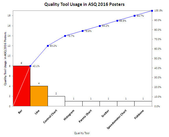
Shouldn’t quality improvement stories should be told with tools of quality, not simple line and bar charts? Shouldn’t we be using charts that went to college and took statistics?
Continue Reading "ASQ 2016 Quality Tool Usage in Poster Presentations"
Posted by Jay Arthur in Healthcare, Manufacturing, QI Macros, Service, Six Sigma.
A customer called today confused about her data. She wanted to draw a control chart and thought the data might have a binomial or poisson distribution. She thought it was attribute data. She’d used the QI Macros Control Chart Wizard to create a control chart of her data and it chose an XmR chart. She wasn’t sure that was right. When I asked her what kind of data she had, she said, “write-offs”.
Write-offs are money, plain and simple. Money is variable (a.k.a. continuous or measured) data.
I explained that to her and suggested she stop worrying about what kind of distribution she has and just look at her data.
Continue Reading "Binomial, Poisson, Attribute, Continuous Data Control Chart Confusion"
Posted by Jay Arthur in QI Macros, Six Sigma.
Children seem to like the look of laundry detergent packets, so they eat them and go to the emergency room.
Failure Mode and Effects Analysis (FMEA) is designed to ferret out these kinds of problems in advance.
Failure Mode: Someone (adult or child) mistakes them for candy and eats one.
Effects: Vomiting and even death
Could this simple analysis have prevented this problem before it got to market? Maybe.
Learn more at www.qimacros.com/lean-six-sigma-articles/fmea/
Continue Reading "Detergent Packets Poison FMEA"
Posted by Jay Arthur in QI Macros, Six Sigma.
Microsoft added a box and whisker plot to Excel 2016, but it’s not everything you might hope for. Here’s an Excel 2016 box and whisker plot:
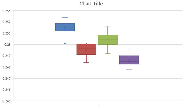
You might notice that the whiskers have a crossbar on the end. It seems to have a spare “x” in the middle of each box and it’s a little hard to see where the median is. And there are unnecessary gridlines that are considered chartjunk. It does, however, show the outlier below the first box.
Here’s what the QI Macros Box and Whisker Plot looks like:
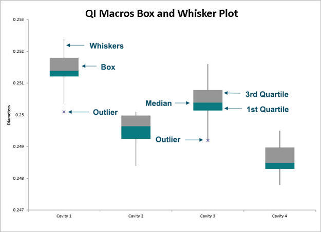
The whiskers are whiskers. The median is easily visible.
Continue Reading "What’s Wrong with the New Excel 2016’s Box and Whisker Plot?"
Posted by Jay Arthur in Excel, QI Macros, Six Sigma, Statistics.

