Home »
Blog » QI Macros » Page 10
Improvement Insights Blog
Latest "QI Macros" Posts
Are you skipping Six Sigma stones across the surface of your business or are you finding people who take to it like a duck to water. People who can dive beneath the surface to find the invisible low-hanging fruit?
“Have you ever skipped a rock across a lake? Maybe the first time you threw it out there it just went “sploosh.” Then you figured out that flatter rocks skip better, so you started throwing them out and they’d go “skip-skip-sploosh,” or maybe get three or four or five “skip-skips” and “sploosh.”
“Then a duck came flying in, put out its landing gear and just kind of eased into the water.
Continue Reading "Skipping Stones or Diving Beneath the Surface of Your Business?"
Posted by Jay Arthur in Agile Lean Six Sigma, Improvement Insights, Lean, QI Macros, Six Sigma.
Over 140 people signed up for this webinar, with Jay Arthur demonstrating how to use some of the useful features of QI Macros, as well as some of the new features introduced in recent releases of the software.
Some attendees were familiar with the software and already use it, some had only begun to use it; all were interested in learning new ways that QI Macros can help them with their Agile Lean Six Sigma and Quality Improvement efforts. (You can hear him answering questions and comments typed in by webinar attendees.)
If you saw a feature demonstrated in the webinar that might have been added to QI Macros after the version you’re using (for instance, the Templates Wizard, the Fixed Limit indicator or the automated Process Change Wizard), you may need to purchase an upgrade to bring your QI Macros to the current version.
Continue Reading "6/9/20 QI Macros Webinar"
Posted by Jay Arthur in Data Mining, Excel, QI Macros, Webinar.
That's root cause analysis: What are the common patterns? Where's the Pareto principle?
Continue Reading "Root Cause Analysis in the Time of COVID-19"
Posted by Jay Arthur in Healthcare, Improvement Insights, QI Macros.
Over 120 people signed up for this webinar, with Jay Arthur demonstrating how to use some of the useful features of QI Macros, as well as some of the new features introduced in recent releases of the software.
Some attendees were familiar with the software and already use it, some had only begun to use it; all were interested in learning new ways that QI Macros can help them with their Agile Lean Six Sigma and Quality Improvement efforts. (You can hear him answering questions and comments typed in by webinar attendees.)
If you saw a feature demonstrated in the webinar that might have been added to QI Macros after the version you’re using (for instance, the Templates Wizard, the Fixed Limit indicator or the automated Process Change Wizard), you may need to purchase an upgrade to bring your QI Macros to the current version.
Continue Reading "5/14/20 QI Macros Webinar"
Posted by Jay Arthur in Data Mining, Excel, QI Macros, Webinar.
Control charts offer a promising way to analyze COVID-19 Data. Learn where to get the data, how to mine it and how to chart it in this video.
Continue Reading "Create a COVID-19 Control Chart Using QI Macros"
Posted by Jay Arthur in Ask Jay, Data Mining, QI Macros, Six Sigma.
People over age 55 account for 92% of COVID-19 Deaths (data from CDC). Sweden is using similar data to leave the country open for most citizens while asking seniors to stay at home. How do we reopen the economy? Self-quarantine seniors; let everyone else get back to work.
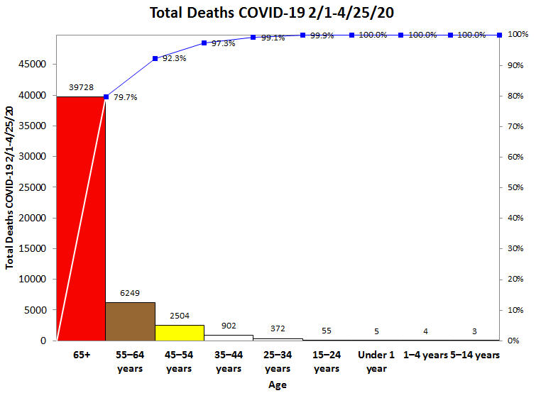
Here’s the 2019-2020 Influenza (i.e., Flu) deaths. Again, seniors are 83.5% of deaths. The flu death rate is about 1 per 1,000. COVID-19 death rate is 1-2 per 100, perhaps lower in people under the age of 55 and higher for those over age 55.
Countermeasure: Self-quarantining seniors will help flatten the curve and prevent overwhelming healthcare.
Continue Reading "U.S. Deaths by Age Group as of 4/24/2020"
Posted by Jay Arthur in Healthcare, Jay Arthur Blog, QI Macros.
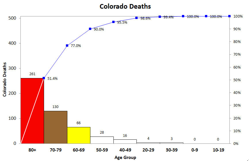
Since 90% of deaths are among those over 60, perhaps the best countermeasure is to require those of us over 60 (me for example) to stay home. Most of us are retired anyway. Let others go back to work.
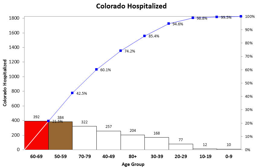
Approximately 51% of Colorado hospitalizations involve people 60-80+, 75% of people over 50. Another reason to ask seniors like myself to stay at home even as the economy reopens. This will help reduce the load on hospitals.
Continue Reading "Colorado Deaths by Age Group"
Posted by Jay Arthur in QI Macros, Six Sigma.
Should a project take 4-16 months or 4-16 hours? Should you measure projects with a calendar or a stopwatch? I think the answer is obvious, but here’s my take on it.
“Hi, I’m Jay Arthur. Every year, we exhibit at lots of conferences with QI Macros so I get to go to presentations by all kinds of folks. Now, last year I saw a presentation by some consultants who said they’d done some research into how long Six Sigma projects take. They found Six Sigma projects take anywhere from four months to 16 months.
“I [thought], “What? How’s that possible?” That makes no sense to me, because I’ve done multimillion-dollar projects in between 4 and 16 hours.
Continue Reading "How Long Should Lean Six Sigma Projects Take?"
Posted by Jay Arthur in Agile Lean Six Sigma, Data Mining, Improvement Insights, QI Macros.
I started wondering, what would the COVID-19 pandemic look like as an improvement story. We have charts about cases and deaths. What might be the root causes and potential countermeasures? Here’s my draft Ishikawa-fishbone root cause analysis diagram and countermeasures. Root causes circled in red.
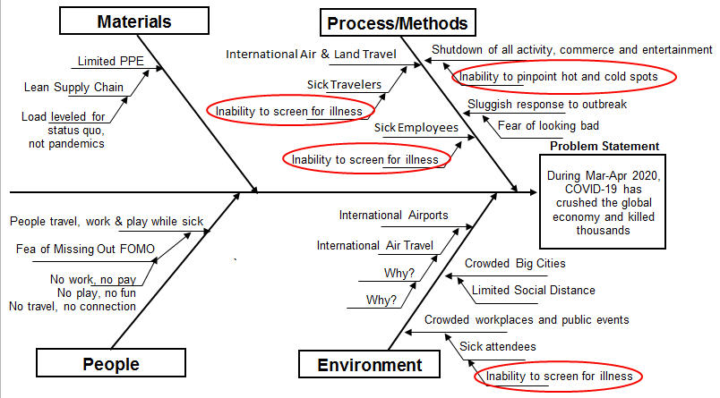
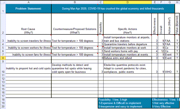
We screen for guns in luggage and knives on passengers, why not temperatures?
As of 4/12/20, NYC accounted for over a third of U.S. COVID-19 cases and almost 50% of deaths. It’s a hot zone. According to one employee, Denver General Hospital has not had a single COVID-19 patient. It’s a cold zone. What are the boundaries of the cold zone?
Continue Reading "COVID-19 Root Cause Analysis and Countermeasures"
Posted by Jay Arthur in Agile Lean Six Sigma, QI Macros, Six Sigma.
While most COVID-19 charts show cumulative cases and deaths, I wondered what would happen if we turned the cumulative data into a daily data and plotted it as a control chart. It is possible to use c or XmR charts for this purpose. Process changes chosen based on runs and trends in the data.
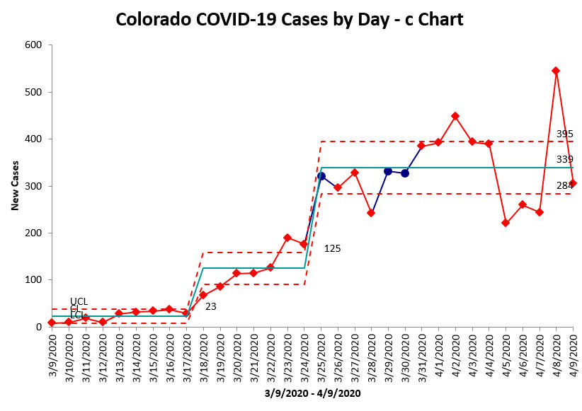
Daily new cases still unstable, but hovering around 339/day. Cases began to rise 3/18. Potentially leveling off 3/26. the date of state “stay-at-home” order.
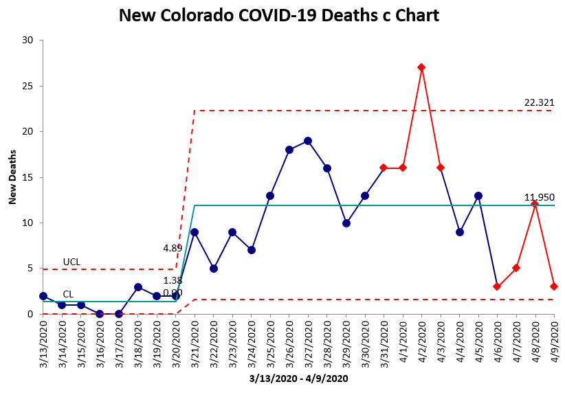
Daily deaths still unstable, but hovering around 12/day. Deaths began rising 3/21, but appear to be stabilizing. Significant spike on 4/2, root cause unknown.
Continue Reading "Colorado COVID-19 Cases and Deaths in Control Charts"
Posted by Jay Arthur in Jay Arthur Blog, QI Macros.

