Home »
Blog » Jay Arthur Blog » Page 6
Improvement Insights Blog
Latest "Jay Arthur Blog" Posts
Answer: Almost always.
- When everything is presented in a bar chart, everything looks the same. And before long, everyone forgets what they’re looking at. Dan Roam
Bar charts always remind me of a Jack-O-Lantern with bad teeth.

Bar charts are one of the most misused charts. The most common mistake is using bar charts for time-series data (i.e., dates):
Bar charts are best used for categories—types of defects, objects, or whatever. Even so, the bars are often in a random order which makes distinguishing the important from the unimportant pretty difficult. Simply sorting the bars into a descending order makes them easier to analyze.
Continue Reading "When are bar charts dangerous?"
Posted by Jay Arthur in Jay Arthur Blog.
A lighthearted and (hopefully) humorous take on the world of statistics and those of us who make our way in it.
Hope you enjoy it!
Statistics Means Never Having to Say You’re Certain by Jay Arthur
Statistics means never having to say you’re certain
My hypotheses are Null
I’m just trying to cull
The signal from the noise
Because statistics means never having to say you’re certain
P values can’t be trusted
My analysis is busted
Because statistics means never having to say you’re certain
The alternative hypothesis
Is cramping my consciousness
Because statistics means never having to say you’re certain
My data isn’t normal
Tukey’s test seems so formal
Because statistics means never having to say you’re certain
You can prove the means are different
Equivalent but not the same
Because statistics means never having to say you’re certain
Wish they told me when I started
The results could all be charted
Because statistics means never having to say you’re certain
Continue Reading "Statistics Means Never Having To Say You’re Certain"
Posted by Jay Arthur in Jay Arthur Blog.
Many people use Run Charts as a way to introduce people to SPC. You can now create a Run Chart with QI Macros and easily change it into a Control Chart.
Watch a video demonstration of this new feature:
Click HERE if you would like more information on our current pricing.
And please note that if you have purchased a QI Macros license within the past (5) years, you are eligible to upgrade to the most recent version at a discounted rate!
Lastly, to view the latest features and enhancements we’ve added, click HERE.
Continue Reading "New QI Macros feature: Change Run Charts into Control Charts"
Posted by Jay Arthur in Jay Arthur Blog, QI Macros.
…that you are missing 32 pages? Here’s a photo of my copy of David Baldacci’s novel, Long Road to Mercy:

Missing 32 pages
Started reading the page only to find a character that couldn’t be at the bottom of the Grand Canyon at this point in the book. Just when it starts building up to a resolution, I’m sent backward in time.
This is not my idea of hassle-free.
Continue Reading "Have You Ever Read Most of a Book Only to Discover…"
Posted by Jay Arthur in Jay Arthur Blog.
Xcel left a message on our phone that we would “experience periodic electrical outages” because they are trying to conserve “natural gas usage due to cold weather.”
Can’t wait to reset all of our digital clocks.
Continue Reading "Xcel Energy Cuts The Power"
Posted by Jay Arthur in Jay Arthur Blog.
How to “hack” Lean Six Sigma for Healthcare Quality and Safety. Recorded at NAHQ 2018 in Minneapolis, MN.
Continue Reading "Agile Lean Six Sigma for Healthcare – NAHQ 2018"
Posted by Jay Arthur in Agile Lean Six Sigma, Healthcare, Jay Arthur Blog.
The Nov-Dec 2018 HBR reports that Lean, Six Sigma and Agile “always work well initially, but often the gains fade quickly.”
- 21% of improvement projects failed to yield any improvements
- Only one-third of improvements continued to yield results after two years.
What’s needed to sustain improvements?
- Consistent measurement and monitoring (i.e., control charts)
- Leadership support and coaching
- Avoid initiative fatigue caused by jumping from one improvement initiative to another.
Start monitoring your improvement projects using QI Macros control charts.
Download a free trial at https://www.qimacros.com.
Continue Reading "Making Process Improvements Stick"
Posted by Jay Arthur in Jay Arthur Blog, Lean, QI Macros, Six Sigma.
If you appreciate how much QI Macros helps you, please tell a friend about the software! Why? Honestly, it’s because we we want to live in a world where more things are done right the FIRST time. Can you imagine:
- … a world where you don’t have to check your takeout order at the restaurant because it’s correct every single time?
- … a healthcare system where an incorrect diagnosis happens only once every 2,000,000 patients?
- … buying a car and knowing that the chance of any defect on the car in the first 10 years is one in 5,000,000?
That’s a world where Quality Improvement is embraced and celebrated.
Continue Reading "Tell a Friend About QI Macros"
Posted by Jay Arthur in Jay Arthur Blog, QI Macros.
We’re excited! From adding Menu Icons to make things easier to find (and easier to add to your Excel Quick Access Toolbar), to adding a Search function to answer those “Where is that one chart…” questions, to the Control Chart Template Wizard… we think this is the most powerful, easiest to use version of QI Macros that there is.
This version is compatible with:
- PC operating systems Windows 10, Windows 8.1, Windows 7
- PCs running Excel 365, Excel 2019, Excel 2016, Excel 2013 and Excel 2010
- Mac operating systems Mojave (MacOS 10.14), High Sierra(MacOS 10.13), Sierra (MacOS 10.12), El Capitan (MacOS 10.11) or Yosemite (MacOS 10.10)
- Mac machines running Excel for Mac 365 or Excel for Mac 2016
If you’d like to upgrade to QI Macros 2018.10, you can purchase a new license by clicking HERE.
Continue Reading "QI Macros Version 2018.10"
Posted by Jay Arthur in Jay Arthur Blog, QI Macros.
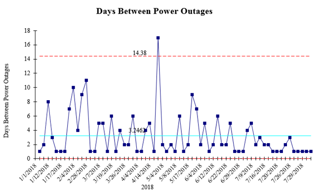
Jeremy Singer-Vine publishes a Data Is Plural newsletter about available data sets. I took the U.S. & Canada power outage data from 2018 and used it with QI Macros Data Mining Wizard to create an improvement project.
I used a g Chart of time between power outages. Averaging a little over 3 days between outages.
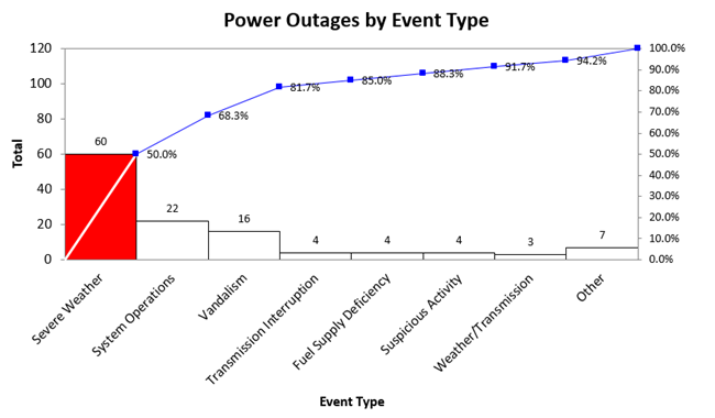
Then, the Data Mining Wizard found the most common cause of outages to be weather. But look at number two: operations. That’s something that could be fixed. Vandalism could also be prevented.
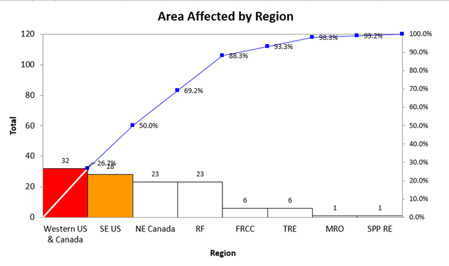
Next, where are outages most likely to occur:
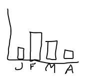
And what month? Readiness months: March-July.
Continue Reading "Electrical Outages Improvement Story"
Posted by Jay Arthur in Data Mining, Jay Arthur Blog, QI Macros, Six Sigma.

