Want to Create a Youden Plot in Excel?
QI Macros has a Ready-Made Youden Plot Template!
Why it Matters: Use a Youden Plot to compare two runs within the same lab and/or two runs between labs.
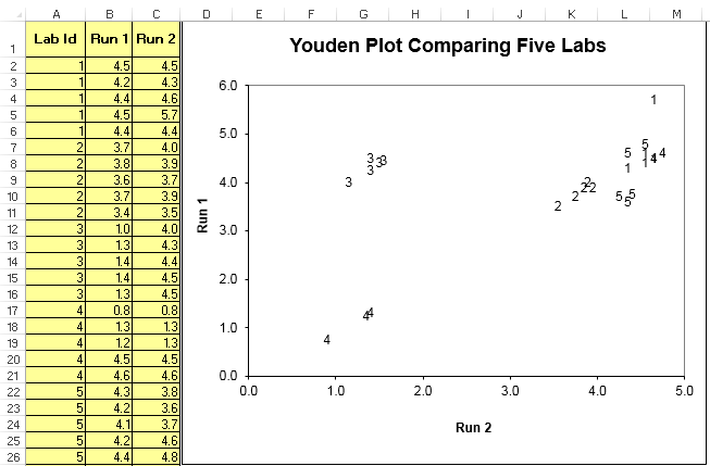
Example of the Youden Plot template in QI Macros
How to Create a Youden Plot:
- Input the Lab id in column A. These entries will be plotted on the chart so keep them short.
- Input data from Run 1 in column B.
- Input data from Run 2 in column C.
How to Interpret a Youden Plot
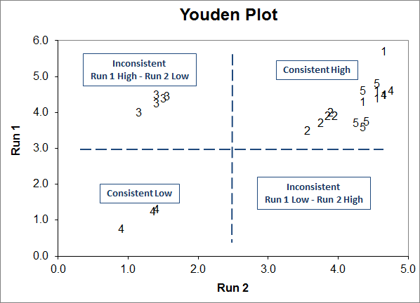
The above Youden Plot shows that lab 4 is biased low. Lab 3 had inconsistency between run 1 and run 2.
Learn More...
Haven't you waited long enough?
Start creating your Youden Plot in just minutes.
Download a free 30-day trial. Get the Youden Plot now!
The Youden Plot is one of many charts and tools included in QI Macros add-in for Excel.
QI Macros adds a new tab to Excel's menu, making it easy to find and open any chart template you need.