Want to Draw a Marimekko Chart or Mosaic Chart in Excel?
Use a stacked column chart or consider Pareto charts for deeper insights.
What is a Marimekko or Mosaic Chart?
Mosaic and Marimekko charts convert data points into percentages and plot them as a bar chart. You can draw this kind of chart in Excel using the stacked column chart.
Go Deeper:
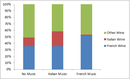
In the example above, a restaurant owner wants to know if the type of music playing in the background affects the type of wine purchased by customers.
In this case, Italian music increases Italian wine purchases (center bar) and French music increases French wine purchases (bottom right bar), but I find this format difficult to analyze. Some argue that this is a form of chart junk that hides the information needed to make good decisions.
Consider a Pareto Chart as an Alternative to a Marimekko or Mosaic Chart
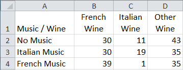
Instead of creating a mosaic plot, we could select the data:
And run Pareto charts using QI Macros add-in for Excel:
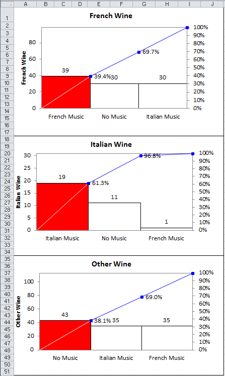
From these three charts, it's easy to see that the Other and French Paretos are pretty flat, meaning that music may have little or no impact on the wine selected. If we look at the Italian wine (middle Pareto), however, Italian music has a significant impact on whether or not Italian wine is chosen. French music effectively kills Italian wine sales.
If we look at total wine sold, no music or Italian music sells about 12% more wine than French music:
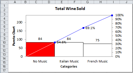
This isn't evident from the Mosaic plot.
Here's the Point
There's more than one way to display data on charts. Trying to cram everything onto one chart can make it hard to decipher and hide critical information. When in doubt, use multiple charts to make the case clearly.
Haven't you waited long enough?
Start creating your Pareto chart in just minutes.
Download a free 30-day trial. Get the Pareto chart now!
The Pareto chart is one of many tools included in QI Macros add-in for Excel.
QI Macros adds a new tab to Excel's menu, making it easy to find any tool you need. If you can't locate a tool, use the find tools feature on the far right side of QI Macros menu.