Data Format & Selection Tips
Get Your Data Ready to Create Charts in Excel
When you select the data you want to graph, you can select the associated labels as well (e.g. Jan, Feb, Mar, etc.) QI Macros will usually use the labels to create part of your chart (e.g. title, axis name, legend). Make sure you follow these rules when formatting your data.
- Labels should be formatted as text. If your labels are numbers (e.g. 1,2,3) you may need to make them text so that Excel doesn't treat them as part of your data. To do this, you will need to put text in front of them. Some examples are :Sample1, S1, Lot1, L1. If you just want the 1 to show then you will need to put an apostrophe ' in front of each number to change it from data to text (e.g. '1, '2, '3 etc.) Note: just using the format function in Excel does NOT work.
- Data should be formatted as numbers. Your data must be numeric AND formatted as a number for the macros to perform the necessary calculations. If you have "data" that is left justified or looks like 001, 002, 003 then it is formatted as text and the macro may not run.
Tip: Data exported from Microsoft Access is often in text format. To change it to numeric: 1) import the data to Excel, 2) put the number 1 in a blank cell, 3) Edit-Copy the cell with the 1 in it, 4) select the imported text data, and 5) choose Edit-Paste Special/Multiply to multiply every imported cell by 1 which will convert them to numeric data.
- Select the right number of columns. Each chart requires a certain number of columns of data to run properly. They are:
- Beware of "hidden" rows or columns. If you select columns A:F, but B and C are hidden, the QI Macros will use all five columns including the hidden ones. To select columns that are not adjacent to each other use the control key.
- The QI Macros and the statistical tools work best when data is organized in columns, not rows. So, for an XbarR chart, you might have Sample1, Sample2, ... Sample5 across the top, and then lot numbers or dates down the left-hand side. The macros will work if your data is laid out horizontally in rows instead of in columns, but vertical columns is the preferred method.
- Decimal places. To get the correct number of decimal places, format your data as Numeric (1-6 decimal places) vs General (which has no precision).
Data Selection Tips
If the labels and data are not adjacent, you can use the control key function in Excel (select the first set of data, press down on the control key and then select the second range of data.)
Don't select the whole column or row, just the data and associated labels you want to graph.
If you have two rows of headings or two columns of labels BE CAREFUL. Selecting the extra columns or rows may create problems with your calculations and with your chart.
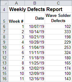
The example below has two rows of headings. Row 1 "Weekly Defects Report" and Row 2 : week #, date, defects. It also has two labels. Column A for week # and column B for dates.
Fool proof your charts by formatting your data with only one descriptive row and column.
Why wait? Start creating these charts and diagrams in seconds using
QI Macros add-in for Excel.
Join 100,000+ Users
in 80 Countries
![]()
