What Do I Do With My Data?
About once or twice a week, I get an email like this one :
Dear Jay,
I am trying to teach myself how to do a 3 sigma control chart based on the attached data. Can you give me any advice or show me what the final solution looks like for this example? A bit difficult to get assistance with this. And yes, I downloaded the 30 day trial but was completely lost. Thanks!
Signed, Lost in the Data
Sometimes I feel like "Dear Abby" for Six Sigma.
Dear Lost in the Data,
Sadly, you're trapped by the data's layout. What I find tragic is that there are several great improvement projects in this data, but because of the way it's organized, they are hard to find.
Here's Your Data:
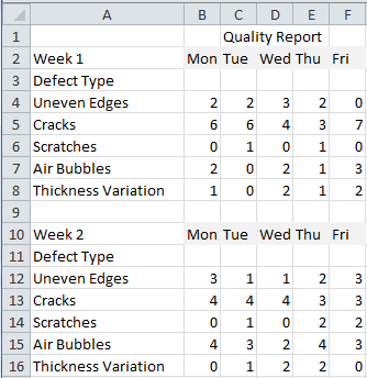
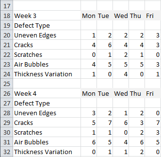
What's Wrong With This Data?
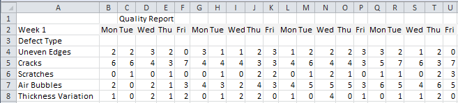
First, it's formatted for the human eye, but not for charting. To chart this data, it has to be in rows or columns, but not split up like it is here. The solution is to cut and paste the data into the same rows:
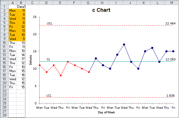
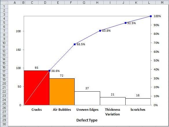
Second, it needs to be summarized before it can be charted. I've added totals to the bottom and right side to make it easy to draw a c chart and pareto chart with QI Macros:
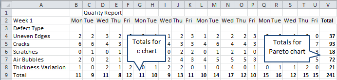
Now it's pretty easy to run a c chart (A9:U9) and pareto chart (W4:W8) on the data:
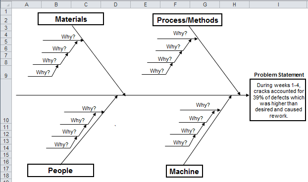
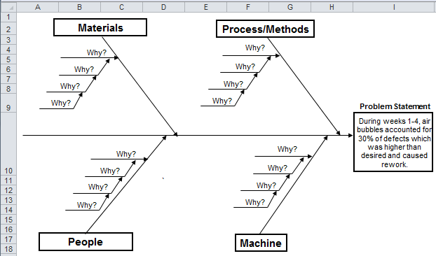
Once the data was organized correctly, it only took me a couple of minutes to create these improvement stories using QI Macros. You can too. Reorganize your data and use QI Macros Improvement Project wizard to create an Improvement Story in minutes.
Even QI Macros Can't Save You From Poor Data Layouts
One of the barriers to Six Sigma isn't the tools or methods, it's your data!
Every week I see spreadsheet after spreadsheet that's so chopped up that it's useless for charting. And most of the time it's not summarized properly either.
Face it, unless you're an accountant or finance person, no one can't read spreadsheets anyway. Stop trying to make your spreadsheets more readable; use them to make readable charts!
So, stop chopping up your data. Put it in rows or columns. Add totals where needed. Then you can draw the charts easily and get on with improvement projects.
Signed, Jay Arthur, Lean Six Sigma Money Belt
Stop using old technology!
Upgrade Your Excel and Data Analysis Skills to Smart Charts Using QI Macros.
Track Data Over Time
Line Graph
Control Chart
Compare Categories
Pie Chart
Pareto Chart
Analyze Variation
Bar or Column Chart
Histogram
QI Macros add-in for Excel makes creating smart charts a snap.
Join 100,000+ Users
in 80 Countries
![]()
