Visual Presentation of Data
I recently stumbled over a book called Visual Explanations by Edward R. Tufte (Graphics Press, Cheshire, CT, 1997). The New York Times called him "the Leonardo da Vinci of data." Tufte says:
There are right ways and wrong ways to show data; there are displays that reveal the truth and displays that do not.
Space Shuttle Challenger
Tufte tackles the data and presentation used by Morton Thiokol to show O-ring damage on previous shuttle flights. The graphs used cute little rockets to show O-ring damage over time:
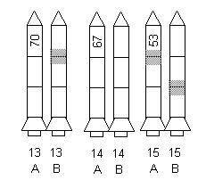
The temperature at time of launch is shown on rocket A and the O-ring damage on the recovered boosters shown as gray or hatched areas. As you can imagine, put 50 of these in a row and it's hard to tell what's really going on.
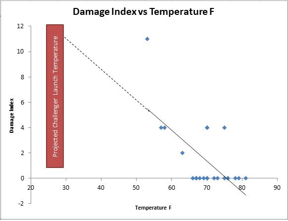
If, however, you use the O-ring data to draw a scatter plot shown below, you can use the trend line to back into the potentially catastrophic problems awaiting the space shuttle Challenger:
If you use a c chart to plot the damage index, you get a chart that tells you that the one 53 degree launch is special cause variation, but also that the entire launch sequence is unstable:
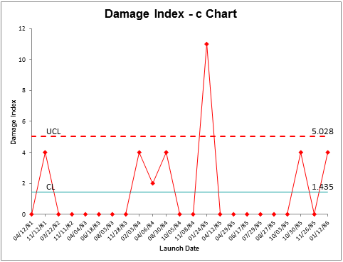
If the process was this unstable, maybe it needed some serious root cause analysis before liftoff.
The Right Picture is Worth a Thousand Words
Information displays should serve the analytic purpose at hand.
Here are some of Tufte's insights:
- Numbers become evidence by being in relation to something. The numbers indicating the temperature on the rockets aren't really in relationship to anything. Similarly, numbers on a spreadsheet can be hard to read.
- The Disappearing Legend - When the legend on a chart is lost (in this case the meaning of the gray areas on the rockets), the insights can be lost as well.
- Chartjunk - good design brings absolute attention to data. Bad design loses the insights in the clutter.
- Lack of clarity in depicting cause and effect. In the rocket charts, no matter how cute, the cause and effect of temperature vs. O-ring damage is lost.
- Wrong order - a fatal flaw can be in ordering the data. A time series (i.e., a control chart) may not reveal what a bar chart (i.e., a histogram) might reveal. In this case, a scatter diagram reveals all you need to know
Here's my point
I usually draw as many different charts from the same data as I can to see which one tells the best story. You should too. Every picture tells a story, but some pictures are better than others at telling the story. QI Macros make it easy to draw one chart after another so that you can quickly discard some of them and select others that engage the eye in the real issues.
As Tufte would probably say: Don't let your charts become disinformation. There's enough of that in the world already.
Warning: include(/kunden/homepages/26/d362440150/htdocs/qimacros/includes/php/calltoaction-skills.php): failed to open stream: No such file or directory in /homepages/26/d362440150/htdocs/qimacros/free-excel-tips/visual-presentation/index.php on line 86
Warning: include(): Failed opening '/kunden/homepages/26/d362440150/htdocs/qimacros/includes/php/calltoaction-skills.php' for inclusion (include_path='.:/usr/lib/php7.4') in /homepages/26/d362440150/htdocs/qimacros/free-excel-tips/visual-presentation/index.php on line 86
Smart Charts Included in QI Macros for Excel
Join 100,000+ Users
in 80 Countries
![]()
