Time Between Charts
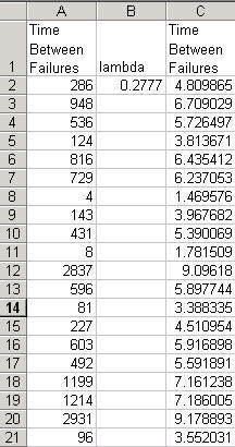
When defect rates become low (closer to 3.4 parts per million), you can use QI Macros to draw a "time between" chart. Since the time between defects (or units between failures) approximates an exponential distribution, you can transform the data using Box Cox (lambda = 1/3.6 =0.2777) and graph the result.
Box Cox
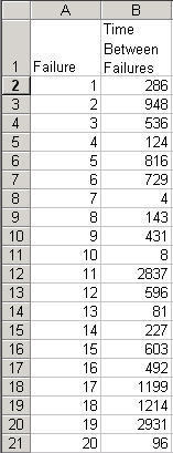
Here's some data from Montgomery's Intro to SPC that can be transformed using box cox to a normal distribution using a factor of 1/3.6 = 0.2777 (Weibull factor):
To do this in QI Macros:
- Select the time between or number of units between failures data (B1:B21).
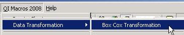
- Click on the QI Macros menu and select Data Transformation-Box Cox:
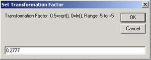
- Enter the transformation factor (0.2777):
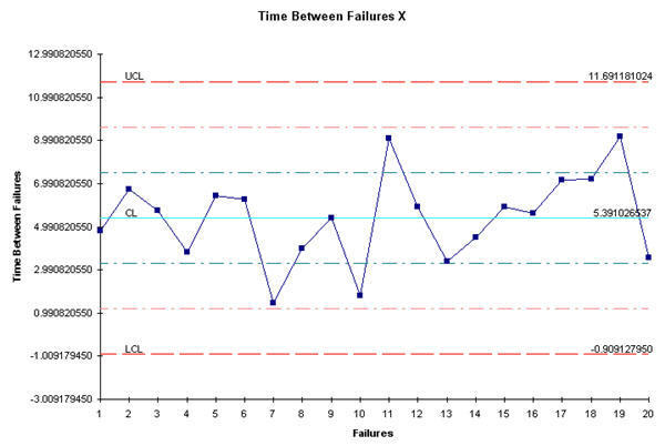
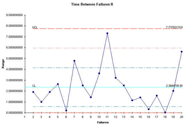
Time Between XmR Chart
Then select the transformed data and run an XmR Chart:
Time Between Template
You can also use the QI Macros t Chart template, which converts the transformed time back into regular time before plotting the chart.:
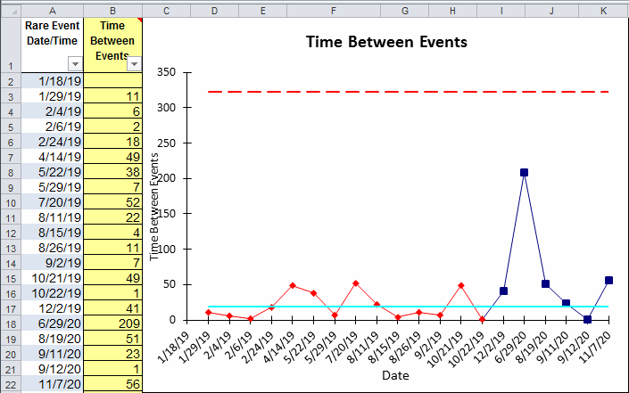
Note: What is Transformed Time? When using the t-Chart, note that it is calculating a rare occurrence, which is then modeled by the Poisson distribution, then the times between occurrences will be exponentially distributed. The exponential distribution is highly skewed, so plotting the times would result in a control chart that is difficult to interpret. The exponential can be transformed to a symmetric Weibull distribution by raising the time measure to the 1/3.6 = 0.2777 power or [y = t 0.27777].
Other Charts Included in QI Macros for Excel
Join 100,000+ Users
in 80 Countries
![]()


KnowWare International, Inc.
2696 S. Colorado Blvd., Ste. 555
Denver, CO 80222 USA
Toll-Free: 1-888-468-1537
Local: (303) 756-9144