Evaluating Patient Satisfaction Survey Data with Control Charts
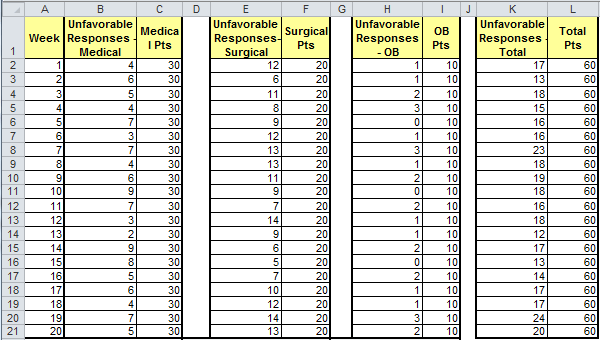
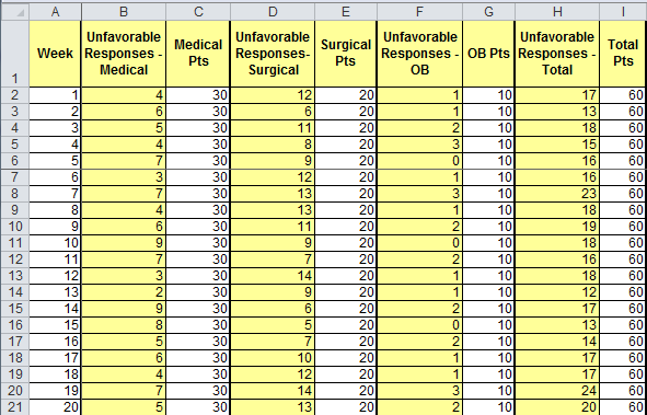
In Raymond G. Carey's book, Improving Healthcare with Control Charts, he presents a case study on improving inpatient satisfaction using qualitative survey data. Medical, surgical and OB patients were interviewed every week to determine their level of satisfaction. Any patients with less than "excellent" responses were counted as "unfavorable." The resulting data looks like this in Excel (See QI Macros Test Data Healthcare SPC2.xls):
Turn Survey Data into p Chart Data
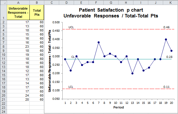
To analyze the overall performance, use QI Macros to run a p chart of total patients (columns K and L):
Comparative Control Charts
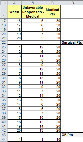
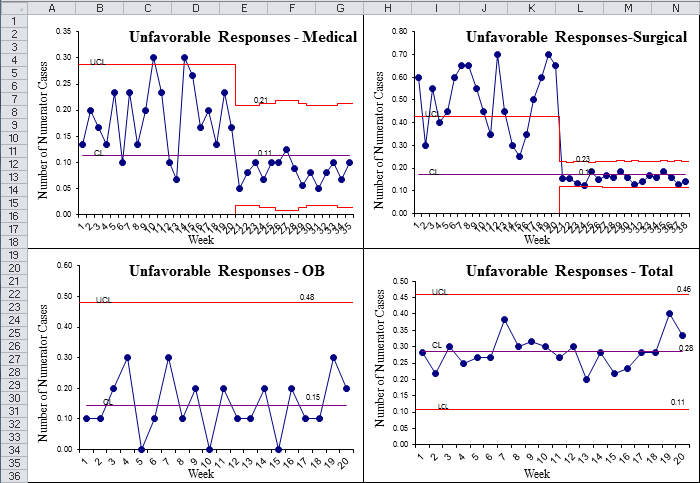
Since overall performance is stable, the hospital needs to compare medical, surgical and OB performance. To do this in QI Macros, stack the data in three columns leaving a blank row between each unit's data:
And run a p chart:
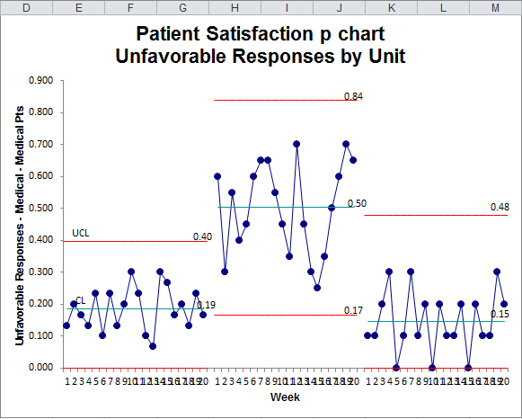
From this p chart we can see:
- Performance is stable in each of the three units
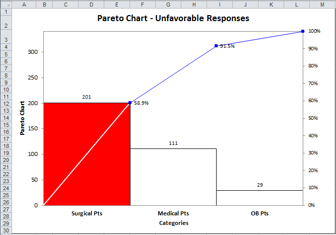
- Surgical patients have a higher rate of dissatisfaction (50%)
- OB patients have a lower rate (15%) than medical patients (19%), but more variability.
Drill Down Using Pareto Charts
Using Pareto's rule, the hospital started with the "worst first" (i.e., surgical) to implement improvements.
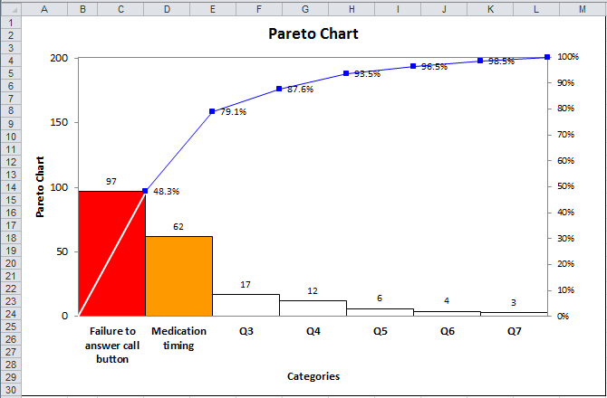
The surgical nursing staff used a pareto chart to determine that only two of the nine questions asked caused dissatisfaction (failure to answer call button and medication timing). (Note: This data was made up to show the next level of analysis. It isn't in Carey's book.)
Use Stair Step Limits to Highlight the Process Improvement
In the following year, the surgical unit initiated improvements. Use a QI Macros p chart with a before and after control limits to show the improvement:
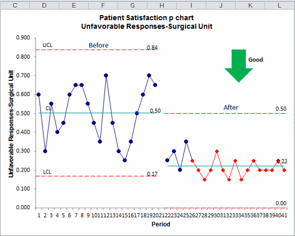
This shows a reduction from 50.3% dissatisfied to only 22.2% dissatisfied. The red points after improvement indicate that the data is "hugging" the center line which may require analysis.
Control Phase
The hospital units continued to survey patients every week and plot this data in a p chart to monitor ongoing performance. One easy way to do this would be with the QI Macros c, np, p, u Control Chart Dashboard. Put the data into the data sheet which can be updated every week:
Then create a p chart dashboard:
To keep this up-to-date, simply add data to the data sheet and click the Refresh Charts button. To analyze stability, click the Refresh with Stability button.
Qualitative Data Can Be Turned Into a Control Chart
This example shows how to use a p chart to measure and monitor patient satisfaction in a hospital. And with every hospital being paid or penalized for their level of patient satisfaction, this kind of analysis is sorely needed.
Could hospital managers do this with nursing and physician satisfaction data? Sure.
Could any service business do this with customer surveys and complaints? Of course.
The data is out there. Isn't it time to start measuring and monitoring it?
Stop Struggling with Control Charts!
Start creating your Control Charts in just minutes.
Download a free 30-day trial. Get Control Charts now!
Other Charts Included in QI Macros for Excel
Join 100,000+ Users
in 80 Countries
![]()


KnowWare International, Inc.
2696 S. Colorado Blvd., Ste. 555
Denver, CO 80222 USA
Toll-Free: 1-888-468-1537
Local: (303) 756-9144