Struggling to Explain Statistics to Others?
QI Macros Draws Charts to Explain the Meaning of Statistical Tests
While it's easy to run an ANOVA or t-Test to get a p-value, it can be hard to explain to coworkers and leaders exactly what that means. That's why QI Macros creates charts as part of the statistical test results it calculates.
ANOVA Single Factor Example
Here is the output of an ANOVA Single Factor test that was run using QI Macros:
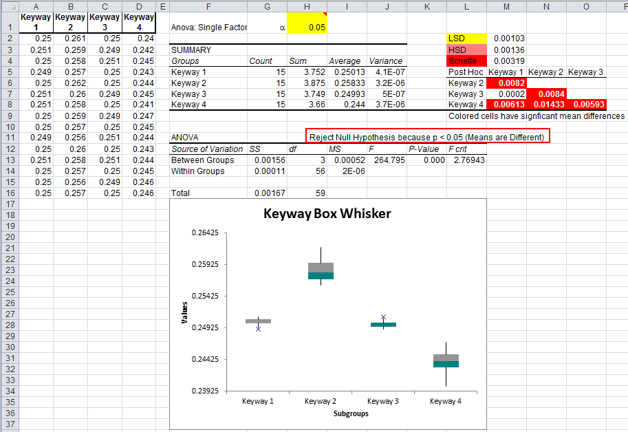
The p-value (cell K13) is zero, so we can reject the null hypothesis that the means are equal (means are not different). The Box and Whisker Plot drawn below makes this comparison even clearer. The means (near the place on the box where the colors change) are not similar. Keyway2 is high; Keyway4 is low; and Keyway's 1 and 3 are similar.
Using Control Charts to Compare Means and Variances
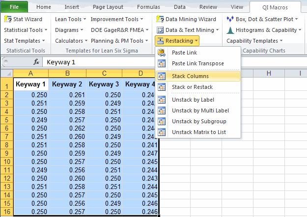
Select the data and use QI Macros Restacking -> Stack Columns feature to stack columns A:D into one column.
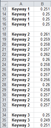
Next, insert a blank row between the data for each keyway.
Now, select the data and choose QI Macros control chart wizard to run a control chart.
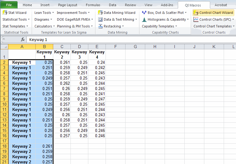
QI Macros will recalculate a new set of control limits whenever it detects a blank row in the data. The resulting XmR chart with separate control limits for each of the four keyways will show the differences in the averages as well as the wider variation in Keyway 2 and 4:
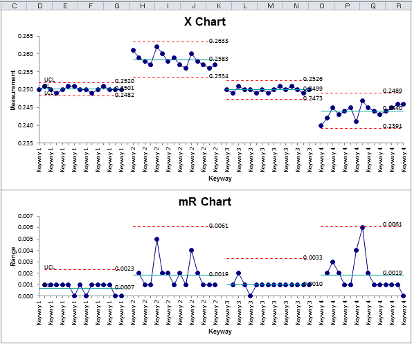
It's also easy to see that Keyways 2 and 4 have a much wider variation in the ranges.
Turn Your Statistics into Charts that Everyone Can Understand
Once you have a significant difference, it's easy to use QI Macros Box & Whisker or Control Charts to turn that difference into a chart that you can explain to anyone.
Stop using old technology!
Upgrade Your Excel and Data Analysis Skills to Smart Charts Using QI Macros.
Track Data Over Time
Line Graph
Control Chart
Compare Categories
Pie Chart
Pareto Chart
Analyze Variation
Bar or Column Chart
Histogram
QI Macros add-in for Excel makes creating smart charts a snap.
Join 100,000+ Users
in 80 Countries
![]()
